Defining dropzones for ShopBuilder contents
We added the possibility to compartmentalise ShopBuilder contents into smaller sections that can be edited individually, which we labeled "dropzones". For this purpose, we added the new parameter $dropzone to
the function shop_builder_category_template($categoryId, $contentType, $dropzone).
The function serves to load ShopBuilder contents for specified categories. The $dropzone parameter is the parameter via which theme developers can label individual sections of the page. Take a look at the example below:
Defining dropzones
<div class="top">
    {{ shop_builder_category_template(42, "content", "top") }}
</div>

<div class="main">
    {{ shop_builder_category_template(42, "content", "main") }}
</div>

<div class="footer">
    {{ shop_builder_category_template(42, "content", "bottom") }}
</div>|
Explanation
Here, the theme defines three separate sections , labeled "top", "main" and "footer", respectively. The Twig function takes on the category ID, in this case 42, the type of content, and a unique identifier for each dropzone. |
Regardless of the number of dropzones the ShopBuilder content is divided into, the end user of the ShopBuilder is still only editing a single content, which here is split into three separate sections. The developer of the theme can choose freely, in which parts of the template they display these sections.
In the past, static contents were output with the help of layout containers. We added the new Twig function shop_builder_template($containerName, $contentType, $dropzone). This function works analogously to the one detailed above. Instead of a category ID, however, the function takes on a layout container as parameter, for instance "Ceres::Header" or "Ceres::Footer".
Example of implementing dropzones
In the following example, the user wants to establish 2 dropzones for the ShopBuilder in their theme. The goal is to create 2 dropzones of equal size next to each other. For this, the user’s theme extends the page-design partial and includes new elements in the page body. The theme sets two dropzones as variables, one for the left column and one for the right column. The content type of both dropzones is specified as content.
The layout of the dropzones is controlled by the arrangement of the divs: The row class is used in the enveloping div to determine that both dropzones are to be arranged next to one another. Each dropzone is placed within their own div with a specified column class. The code snippet also includes an if condition.
It is thereby possible to include content around and in between the specified dropzones, for instance by adding another div with the column class between the left and right dropzone. That way, it is possible to construct ShopBuilder pages, in which certain parts can be edited, while other parts remain the same.
{% extends getPartial('page-design') %}

{% block PageBody %}

    {% set shopBuilderTemplate = shop_builder_category_template(category.id) %}
    {% set ShopBuilderTemplateSide = shop_builder_category_template(category.id, "content", "side") %}

    {% if shopBuilderTemplate | trim is not empty %}
        <div class="container-max">
            <div class="row">
                <div class="col">
                    {{ shopBuilderTemplate | raw }}
                </div>
                <div class="col">
                    {{ ShopBuilderTemplateSide | raw}}
                </div>
            </div>
        </div>
    {% else %}
        {% include category_template( category.id, lang, webstoreConfig.webstoreId) ignore missing %}
    {% endif %}
{% endblock %}
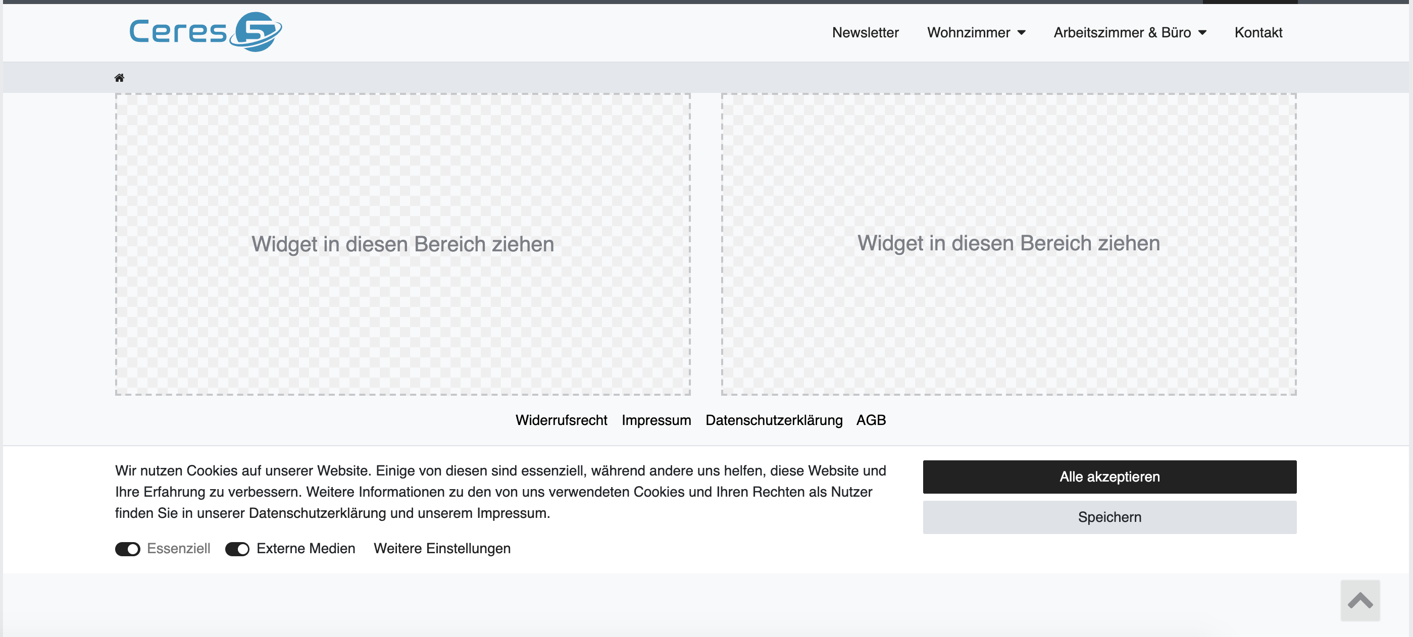
The image below shows the resulting arrangement of the dropzones in ShopBuilder:

Implementing dropzones in the single item view
In plentyShop, the single item page is one single Vue component. In order to make item data accessible from within item widgets, ShopBuilder contents need to be injected into this component using slots instead of inserting them in the component template directly.
In the default plentyShop LTS template for single item views, the ShopBuilder content is injected as one default slot:
<single-item
	...
	v-slot="slotProps">

	{% set currentCategory = services.category.getCurrentCategory() %}
	{{ shop_builder_category_template(currentCategory.id, "singleitem") | raw }}

</single-item>
If you want to provide multiple dropzones, you need to inclue named slots, inside the single item component. In the example below, the named slots are default-dropzone and second-dropzone:
<single-item ...>

	{% set currentCategory = services.category.getCurrentCategory() %}

	<template #default-dropzone v-slot="slotProps">
		{{ shop_builder_category_template(currentCategory.id, "singleitem") | raw }}
	</template>

	<template #second-dropzone v-slot="slotProps">
		{{ shop_builder_category_template(currentCategory.id, "singleitem", "second-dropzone") | raw }}
	</template>

</single-item>|
The |
The provided slots can be used anywhere in the template of the Vue component, but needs to be wrapped in any block element:
<script type="x/template" data-component="single-item">
<div>
	<slot :getDataField="getDataField" :getFilteredDataField="getFilteredDataField">
		<div class="single container-max page-content">
			...
			<div>
				<slot name="default-dropzone"></slot>
			</div>

			...
			<article>
				<!-- DON'T: Slots providing a dropzone cannot have any sibling elements! -->
				<p>This is not allowed!</p>
				<slot name="second-dropzone"></slot>
			</article>

			...
			<span class="d-block">
				<!-- DON'T: This will cause errors on item widgets since they cannot access item data even if it might work with static widgets. -->
				{% set currentCategory = services.category.getCurrentCategory() %}
				{{ shop_builder_category_template(currentCategory.id, "singleitem", "third-dropzone") | raw }}
		</div>
	</slot>
</div>
</script>
The example above includes two erroneous injections: The <p> tag embedded in the <article> tag will lead to errors because it is included as a sibling element to the slot that includes a dropzone. In the <span> tag below, the dropzone has been injected without using a slot. While this is possible for static widget data, it will lead to errors where dynamic item data is concernerd. You should refrain from using either of these ways of injecting your dropzones!